By Larry Gross, Vice Dean of USC Annenberg
I have been asked to reflect on the challenges and opportunities presented by the experience of [re]designing Annenberg Schools.
It is true that I am probably uniquely qualified to offer such reflections as I have been intimately involved with three separate Annenberg School building projects.
The first was in the early 1980s, when the Annenberg School at Penn undertook a significant expansion of its 1960s-era building, and the second was a major renovation of the original school that was completed in 2000. Most recently, I was closely involved in the now happily completed planning and construction of Wallis Annenberg Hall. The original Annenberg School buildings at Penn and USC had something important in common: the architects commissioned to build them were not provided with any sort of coherent program to guide their planning, because, in truth, there was no one available to provide such guidance. In both cases, the planning and building preceded the hiring of the faculty and the creation of the academic programs that would be housed in the building. The result, in both cases, was a certain amount, to put it generously, of architectural incoherence and confusion. The Annenberg School at Penn was constructed as a “square donut” with a core that was, in familiar mid-century style, split-leveled off of the surrounding floors. Thus, the building was rife with half-flights of up- and down-stairs as one went from the outside corridors to the inner core. Needless to say, this later became a source of serious design and construction challenges in the post-Americans with Disabilities Act insistence of access for all. The center core of the building contained a two-story TV studio, state-of-the-art circa 1950s, outfitted with studio equipment recycled from Walter Annenberg’s local TV station. Above that was a two-story library and, above that, a two-story auditorium highly reminiscent of your high school, but with minimal backstage space. However, this design skimped on classrooms, which became a problem when the Annenberg School introduced an undergraduate major, and suddenly we needed more and bigger classrooms; and it had no research space to speak of. In addition, that ever-growing reality of academic life, the computer, and its accompanying physical and human components, began to demand space. In the early 1980s, therefore, we began the process of retrofitting existing spaces and creating new ones that would suit the needs of a school far larger and different from anything understood by the original architects.
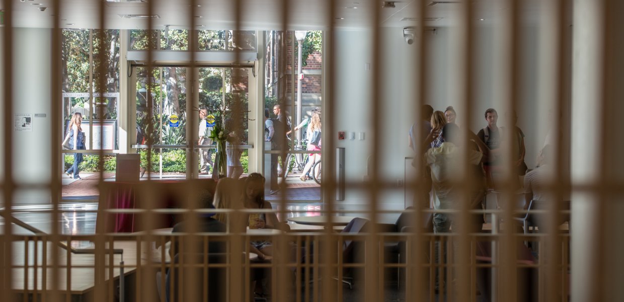
This process was repeated 15 years later, as the school had, once again, outgrown its space, and we converted the hardly-used auditorium into two stories of offices, with a penthouse conference space. USC’s Annenberg School, designed in the early 1970s by Architectural school dean A. Quincy Jones, is an example of Mid-Century Southern California architecture, and blessedly free of split-level challenges. But it had its own special qualities that had nothing to do with academic programming, and once again, certainly no coherent relation to the activities that soon took place inside. Among its features was the near total lack of inside staircases, so that one was always going outside to climb up or downstairs, and often found oneself locked out when trying to re-enter. Over the years the building was added to, dramatically transforming the inner spaces—such as adding stairs and an elevator to the East Lobby, and fitting new offices and classrooms into interstitial spaces. Creative, but definitely confined within the parameters of an existing structure and limited by earlier decisions made without any obvious reasons [I’m not even getting into the matter of the Center for the American Experience, a short-lived project whose carcass constitutes the West wing of the school]. In stark contrast to these earlier experiences, the planning and construction of Wallis Annenberg Hall was a model of consultation and collaboration, with faculty, staff and students of the school actively involved in the analysis, planning and design of the building. The result is a building that is coherent programmatically, unlike the two original Annenberg School buildings. This building’s interior instantly communicates its function as a laboratory for teaching, research and above all, interaction. The building isn’t simple; it doesn’t give away everything at first glance. Rather, it opens up as a narrative that one moves through, from forum to media center, to classroom, to research spaces and offices.
But it continuously communicates focus and engagement, and it lives up to its goal: to serve the mission of the students, faculty and school.


![[web series] Campaign Junkie](https://annenberg.usc.edu/sites/default/files/styles/news_index_featured_small/public/media-youtube/d5gbSRAjFwQ.jpg?itok=YP9_X3fc)


